
the story of caara
CAARA is a New Delhi-based food company that encompasses a range of gourmet cooking products, two lush cafés, a cookery school and a boutique catering service.

As CAARA’s Head of Visual Content & Communication, I worked with the co-founders to develop a cohesive visual identity that would manifest in the imagery, packaging, and print and digital presence for the brand.
Services delivered: Creative Direction, photography, video production and visual identity design.
Articulating the principles of a ‘CAARA Universe’
In a CAARA Universe —
The food is delicious.
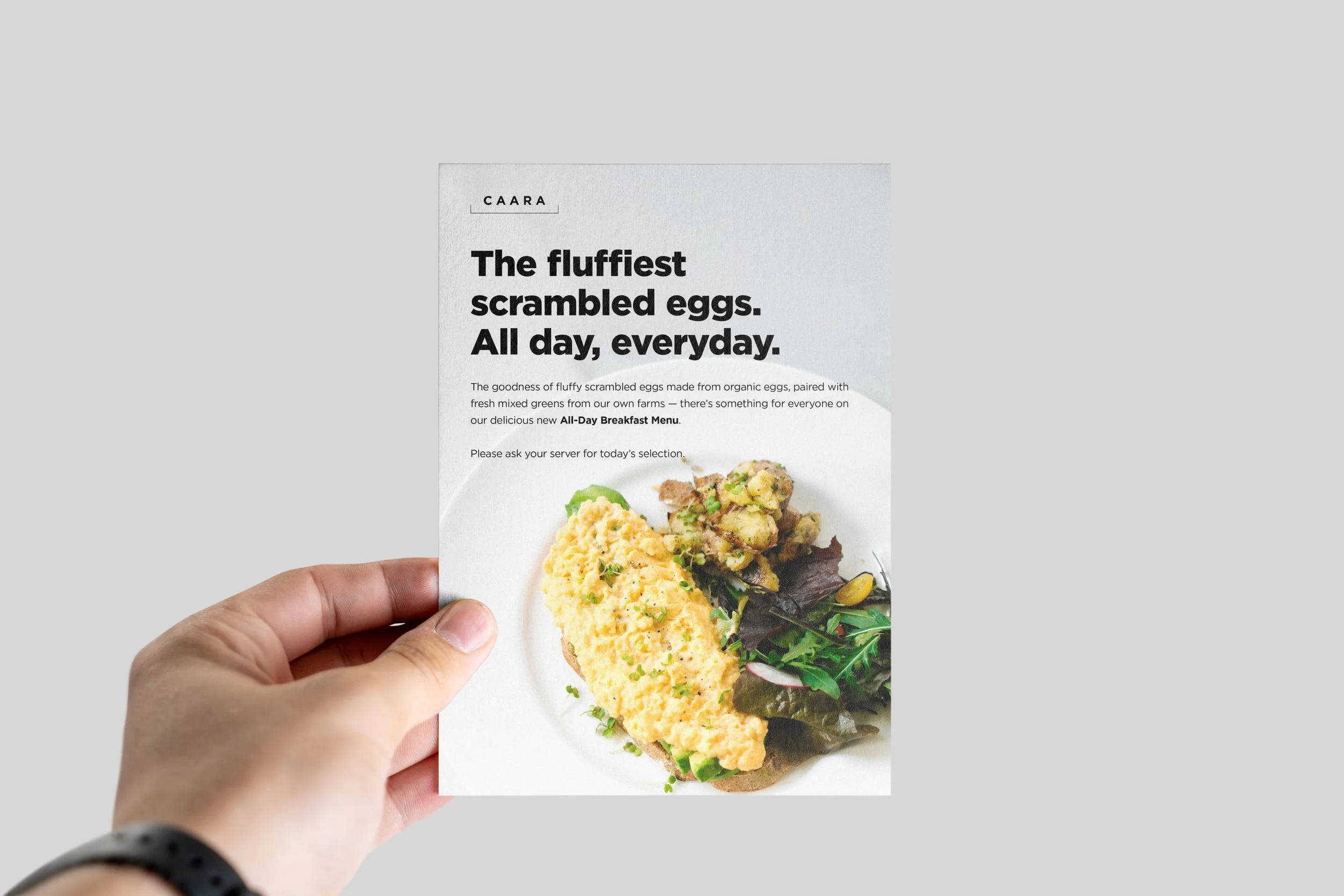
Food that tastes incredible should look elegant and be visually appealing, both in its details and as part of a spread/set.
The ingredients used are always fresh and natural.
Fresh produce and ingredients are fundamental to the final dish/meal/experience.
The products make everyday cooking easy.
The visual aesthetic should demonstrate how easy to put together these ingredients are.


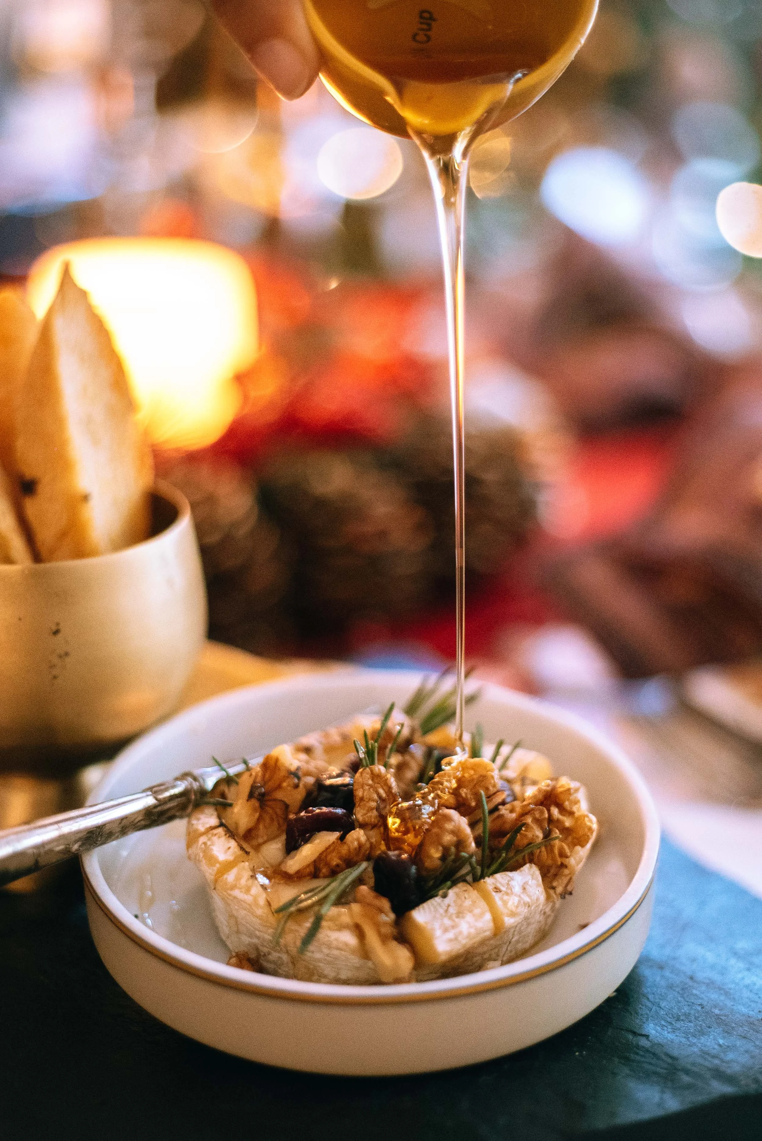
We shot in natural light to convey the freshness and natural simplicity of flavours and ingredients.
Natural skin tones and slightly boosted colour and brightness.
Warm tones: muted white, natural greens, reds and yellows, to convey.
No heavily processed filters, artificial/strobe lighting, cold tones/cool images, plastic/wrappers/too much steel/metal.

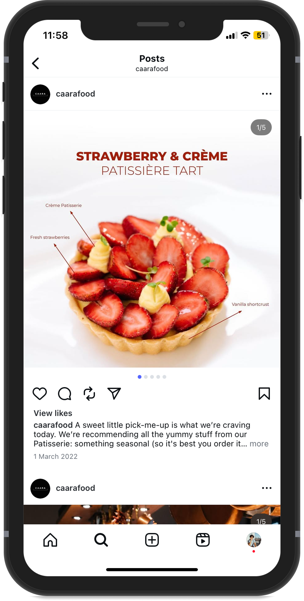
We consistently used close-ups and ‘background blur’ to convey intimacy, detail and texture.


We depicted human interaction in an authentic environment to evoke friendliness and familiarity.
Shot in the kitchen and café spaces respectively to communicate the expected experience.
The café space is about a collective experience: to meet, engage and enjoy over food and drinks.
The home-kitchen is about the simplicity of cooking a meal using CAARA products and how they make the experience friendlier and less intimidating.
Taking this a step further, we produced a video series to showcase easy-to-follow recipes made possible by CAARA’s products.
Titled ‘Cook with CAARA’ and hosted by co-founder Ambika Seth, this series put the spotlight on individual products and positioned CAARA’s product range in their ideal environment — the home kitchen.
It also gave the ‘CAARA Universe’ a face and a voice, humanising the brand and what it stood for.
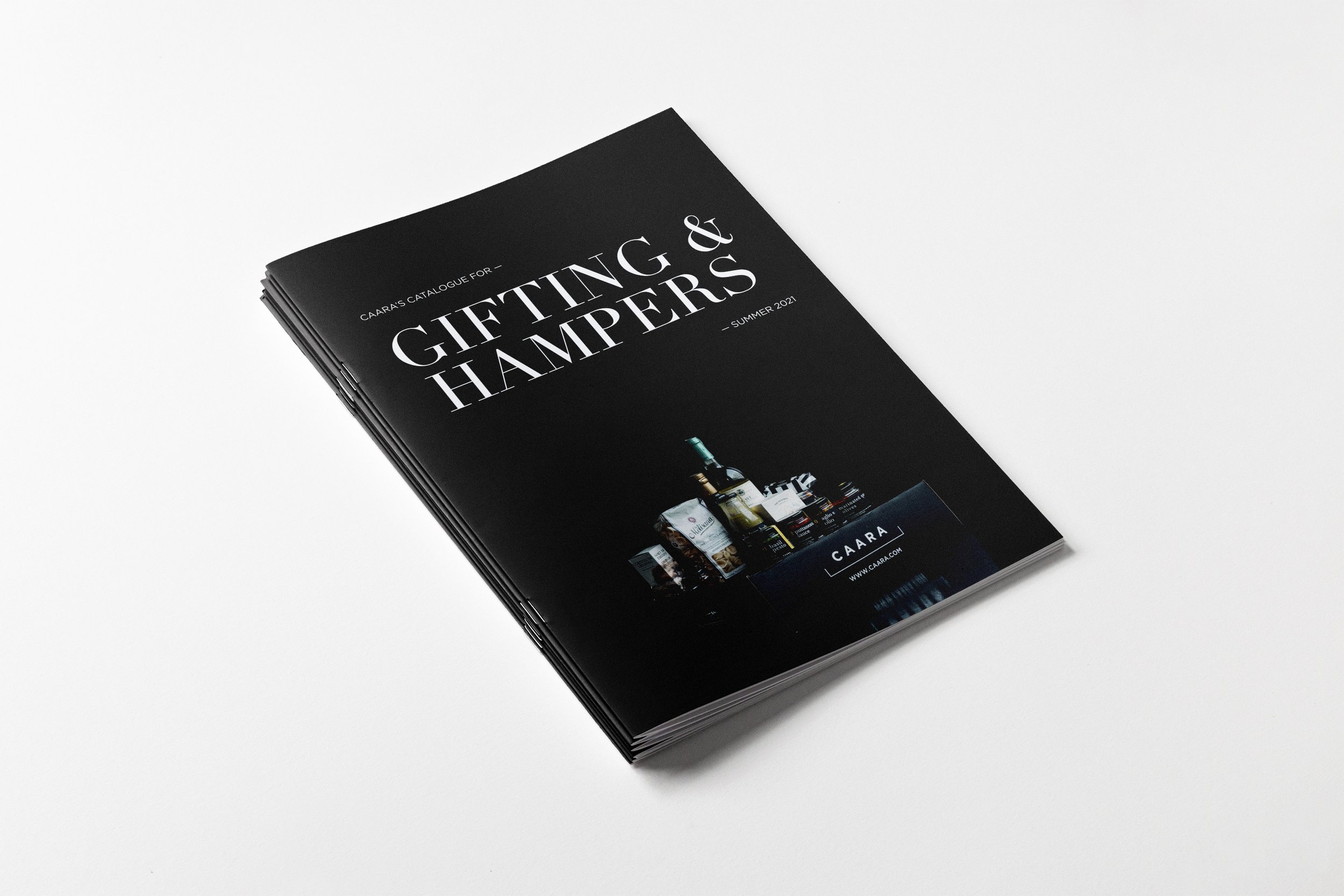
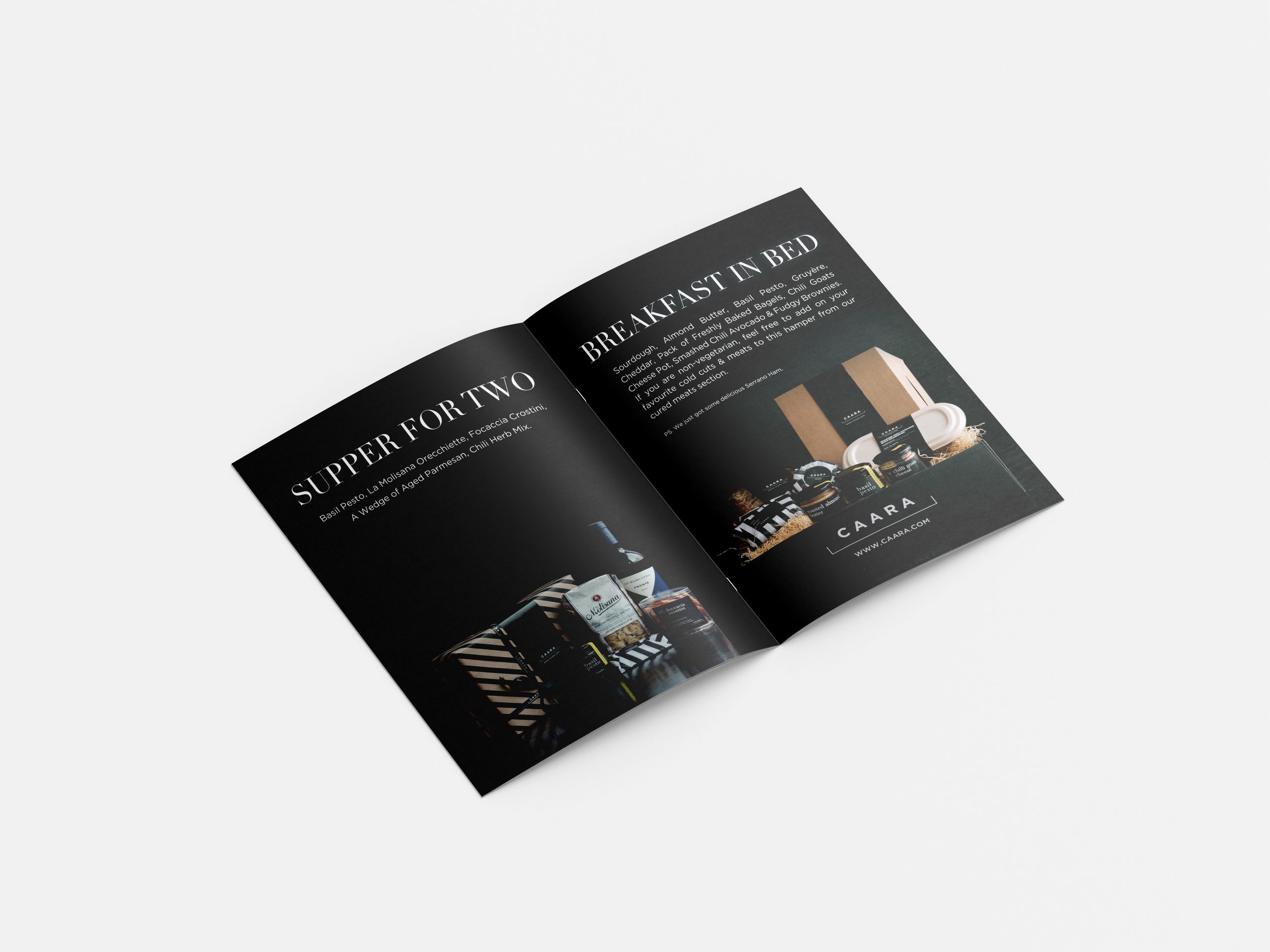
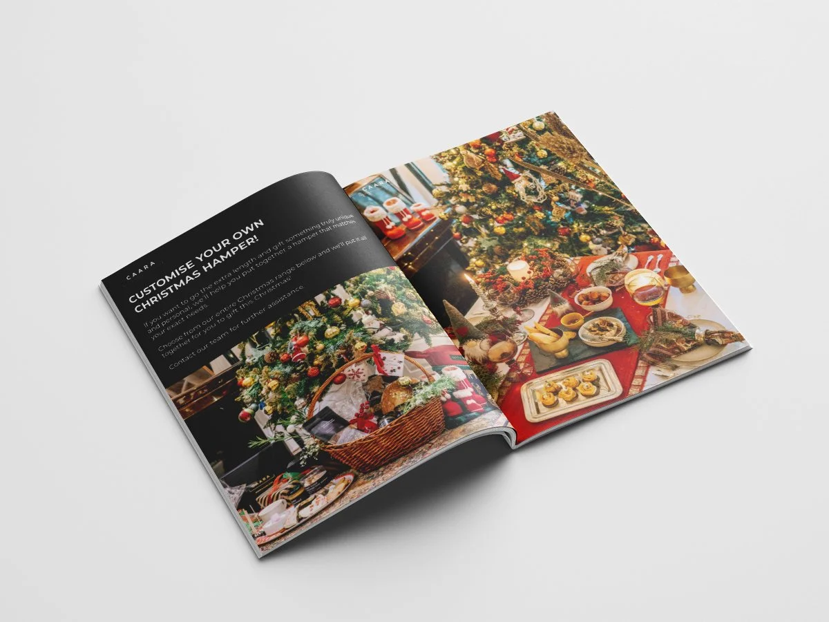
On the other hand, to carve a distinct and luxurious identity for CAARA’s Gifting & Hamper range, we created a bold monochromatic aesthetic featuring bold serif typography.


This further inspired the cover and look for CAARA’s festive collateral - like their Christmas Edit titled ‘Christmas comes home with CAARA’.


‘Celebrating togetherness’ — CAARA’s Diwali campaign focussed on the coming together of friends and family during festive season.
The campaign was inspired by the idea of ‘togetherness’, more relevant than ever, given the national lockdown and its isolating effects on friendships and family get-togethers at the time.


