mandarin with anantika
BRANDING/ VISUAL IDENTITY
For this Mumbai based mandarin-teaching start-up, the challenge was to build a new look from scratch - one that would add character to and borrow from their central philosophy: to make learning Mandarin enjoyable, fun and non-intimidating.

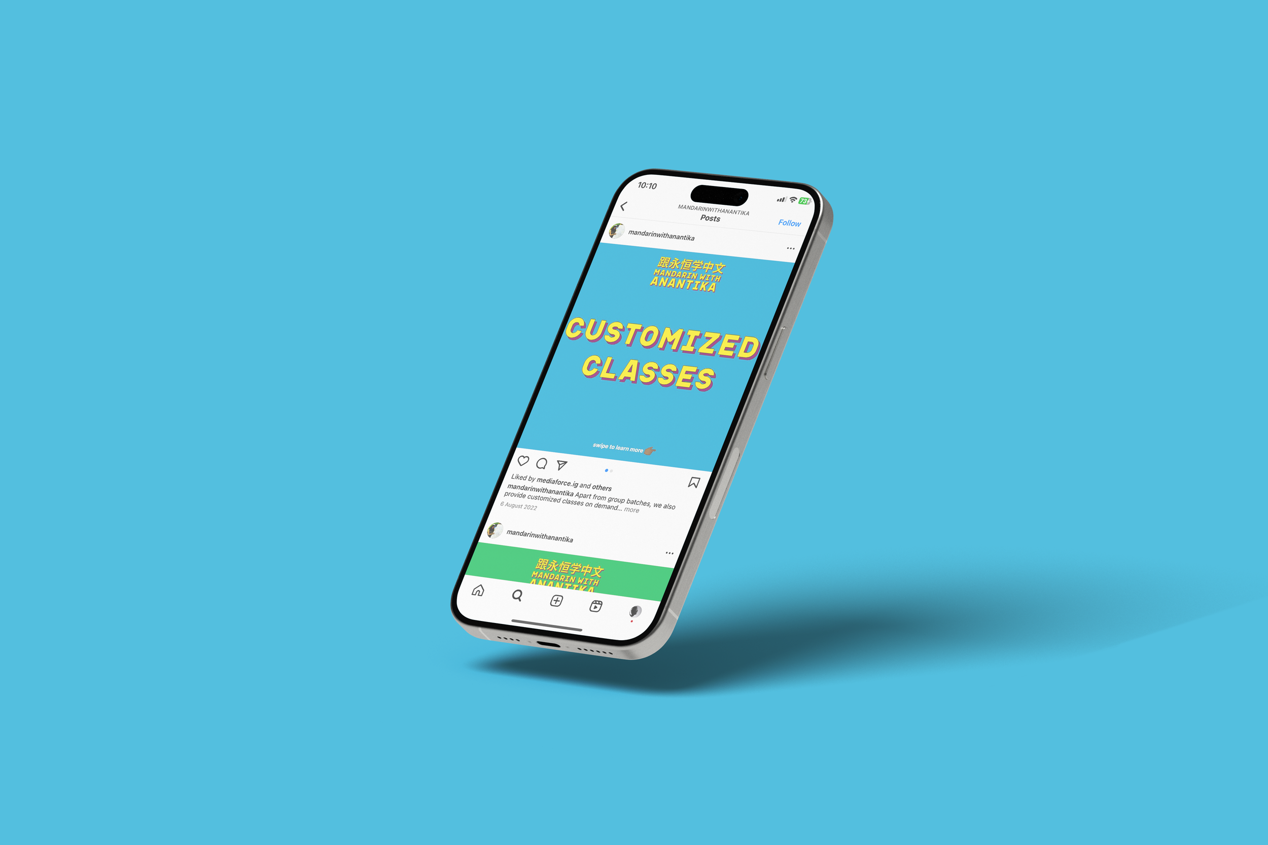
For Anantika, the founder, it was important that we broke away from colours one might traditionally associate with Mandarin and Chinese culture in general: reds, blacks and yellows. This led to a fresh new, vibrant look that was more playful and bold.
Final deliverables included a new logo, a succinct style guide and templates for social media.


the process:

The original aesthetic of the brand was straightforward and clean - built around the typeface ‘Futura’. It did not employ any significant use of colour or mandarin characters at the time.

The first stage was running through an exhaustive brief with Anantika. This became the base - a guiding document we would return to routinely through the design process to make sure we were aligned and working towards a common goal/ design language.
The full brief can be viewed here.
The key moods/ guiding descriptors were: fun, playful, bold, vibrant and non-traditional.
First drafts:


After first drafts, we decided to revisit the drawing board and reflect on some of the core ideas that had emerged from our initial discussions and the brief. I began playing with brighter colours - narrowing the experiments down to three colours: one primary (blue) and two secondaries (green and peach).
Then came the typeface for the brand name and headings: Apice, implemented with a thin, comic-esque black outline.
While the original look emphasised on “Mandarin” as a way to communicate the primary goal of the class, the redesign directed focus on “Anantika”, the co-founder. Her personality and approach was the key differentiator in an otherwise formal language-coaching marketplace - something that had to come through in the branding.

